Choosing the right paint colors is about more than just picking a shade you like; it involves understanding psychology, light, and how fixed elements in your room interact with the hue. A successful color palette creates flow throughout your home while enhancing the function and mood of each individual space.
Start With the Mood and Purpose of Each Room
Color psychology dictates how a room feels, so the first step in selecting a palette is defining the desired atmosphere.
Calming Tones for Bedrooms
Bedrooms are sanctuaries intended for rest, relaxation, and sleep. Therefore, colors with cool or muted undertones are generally preferred as they naturally recede and promote calm.
- Soft Blues and Greens: These colors are heavily associated with nature, reducing stress and creating a tranquil environment.
- Cool Neutrals: Greige (a mix of gray and beige), soft silver-gray, and misty off-whites are excellent choices as they provide a neutral, non-distracting backdrop.
- Muted Purples (Lavender): Associated with creativity and spirituality, lavender offers a subtle sophistication without being overly stimulating.
Bright, Energizing Colors for Kitchens & Workspaces
These areas are centers of activity, concentration, and social interaction. Colors here can be more vibrant, saturated, and stimulating.
- Warm Whites and Creams: In the kitchen, crisp, slightly warm whites reflect light well, making the space feel clean and expansive.
- Saturated Blues and Yellows: In offices or creative spaces, yellows and bright blues can spark energy and focus. Use bright colors sparingly, perhaps on a single accent wall, to avoid overwhelming the eye.
- Bold Reds or Oranges (Accents): Used cautiously, these colors can stimulate appetite and conversation in dining areas or provide a burst of energy in a laundry room.
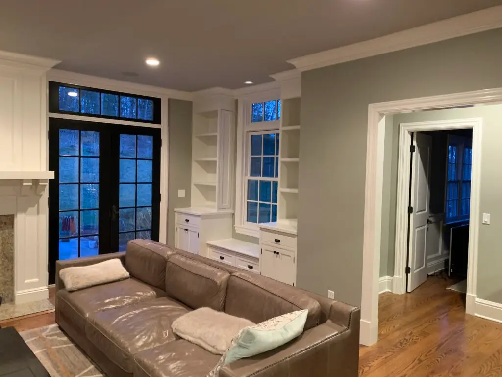
Cozy Neutrals for Living Rooms
The living room is the primary gathering space, demanding colors that are versatile enough to complement various decorations and durable enough to withstand trends.
- Warm Grays and Taupes: These offer the sophistication of gray but with the inviting warmth of brown or beige, making the room feel cocooning and comfortable.
- Deep Greens or Blues (Feature Walls): A strong, deep color on one wall can anchor a living room, especially if it has high ceilings or a fireplace, adding depth and coziness.
- Soft Beiges and Off-Whites: These classic neutrals are easy to live with and allow artwork and furniture to be the focal points.
Understand Undertones and How They Affect the Final Look
The true complexity of color selection lies in understanding undertones—the subtle color visible beneath the dominant hue.
Warm vs. Cool Undertones
Every paint color falls on the spectrum of warm or cool, and this is crucial when pairing colors.
- Warm Undertones: Have hints of yellow, orange, or red. They feel cozy, inviting, and can make a room feel slightly smaller. A “warm gray,” for instance, might have a subtle beige or taupe base.
- Cool Undertones: Have hints of blue, green, or violet. They feel crisp, serene, and can make a room feel larger and more expansive. A “cool white” might reveal a hint of blue or green when placed next to a pure white.
How Flooring and Furniture Influence Color Perception
The fixed elements in your home—your cabinetry, stone countertops, flooring (especially hardwood or tile), and large furniture pieces—all have their own inherent undertones. The paint you choose must harmonize with these elements, as they are not changing.
- Clash Example: If your hardwood floors have a strong red/orange (warm) undertone, choosing a wall paint with a distinct blue/green (cool) undertone can cause a jarring visual clash, even if both colors look good independently.
- Harmony Solution: Test your paint sample directly against your wood trim, kitchen backsplash, or sofa fabric to ensure the undertones agree.
Use Lighting to Guide Your Color Choices
Lighting is the single most powerful factor affecting how a paint color is perceived. A color can look entirely different at noon versus at dusk.
Natural Light vs. Artificial Light
Always test your paint samples under both natural and artificial light sources.
- Incandescent/Warm LED Light: These bulbs typically emit a yellow or orange glow, which will intensify warm paint colors (like reds and yellows) and mute or dull cool colors (like blues and greens).
- Cool/Daylight LED Light: These bulbs mimic bright daylight, emphasizing blues and greens, and making warm colors appear cooler or sharper.
- Fluorescent Light: Tends to cast a harsh blue or green hue, which can be unflattering to most paint colors.
Why North- and South-Facing Rooms Look Different
The direction a room faces dictates the quality and intensity of natural light it receives throughout the day.
- North-Facing Rooms: Receive cool, soft, consistent light all day. This light tends to bring out the cool undertones (blue, green) in paint, often making colors appear flat or shadowed. Recommendation: Choose warm colors (yellows, creams, warm grays) to counteract the coolness, or embrace the shade with deep, saturated colors.
- South-Facing Rooms: Receive bright, warm, intense light all day. This light highlights the warm undertones (red, yellow) in paint. Recommendation: You can use virtually any color here. Cool colors will look less cold, and warm colors will glow. Be mindful that very bright, warm colors might look overwhelmingly intense.
Popular Color Palettes for Modern Interiors
While trends evolve, certain color schemes offer timeless appeal and adaptability, forming the backbone of modern interior design.
Neutral Grays, Whites, and Beiges
This enduring palette is popular for creating a sophisticated, versatile foundation. The key to making neutrals work is layering textures and varying the intensity of the color.
- Greige (Gray + Beige): The dominant neutral for the last decade, offering the perfect balance between cool and warm. It pairs beautifully with both black metal accents and natural wood finishes.
- Off-Whites: Moving away from stark white, warm off-whites with subtle yellow or taupe undertones create a softer, more inviting look that feels less sterile.
Soft Blues and Greens
The biophilic design trend—connecting interior spaces with nature—has popularized these tranquil colors.
- Sage Green: A dusty, muted green that acts almost like a neutral, pairing well with natural wood and leather textures.
- Muted Sky Blue: Excellent for creating a sense of openness and airiness in smaller rooms, often seen in bathrooms and bedrooms.
Deep Accent Colors
Deep jewel tones and saturated colors are used strategically to add personality, especially in the form of accent walls, painted trim, or powder rooms.
- Navy Blue: A timeless deep neutral that provides excellent contrast to bright white trim and wood floors.
- Deep Charcoal or Black: Increasingly used in modern homes on trim, doors, or bookcases to add crisp definition and a dramatic, tailored look.
FAQs About Choosing Paint Colors
“Should all rooms match?”
No, all rooms should not match, but they should flow. A harmonious home uses a consistent temperature or undertone throughout the main living spaces (e.g., all warm neutrals or all cool grays). You can introduce different colors in secondary spaces (bedrooms, bathrooms, offices) as long as they visually connect to the main color palette used in the hallways and entryways.
“How do I test paint samples correctly?”
Testing is mandatory to avoid costly mistakes. Follow these steps:
- Do not paint directly onto the existing wall color. The existing color will distort the sample.
- Paint large swatches (at least 12×12 inches) onto poster board or foam core. Apply two full coats.
- Move the sample around the room throughout the day to see how it looks under different light conditions (morning light, midday, lamp light).
- Place the sample next to fixed elements like trim, furniture, and flooring before making a final decision.
“What colors increase home resale value?”
Studies consistently show that buyers prefer and are often willing to pay more for homes painted in light, neutral colors, as these provide a blank canvas. The most popular colors for maximizing value are:
- Light Gray/Greige: Especially in living areas and kitchens.
- Soft Off-Whites: Used on trim, ceilings, and walls to make spaces feel bright and updated.
- Navy Blue: Can sometimes boost value in front doors or primary bedroom feature walls, offering a high-end, classic feel.
Ready to see these colors in your home?
Schedule a professional color consultation with us today to receive personalized guidance and virtual mockups before you buy a single gallon of paint.