
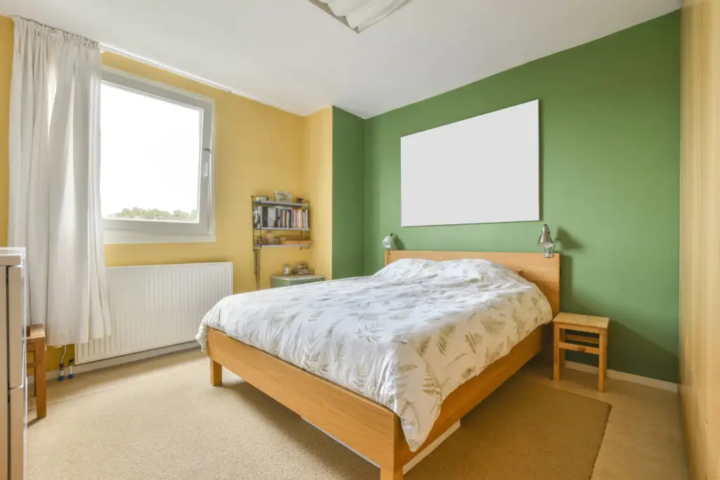
When designing a bedroom, the goal is often to balance tranquility with personal style. While a single paint color can feel cohesive, it can also lead to a room that feels “boxy” or uninspired. Two-tone paint schemes offer a professional, custom-designed look that adds architectural interest to your private retreat without the need for expensive molding or busy wallpaper patterns.
Quick Answer: Two-Tone Paint Adds Interest Without Busy Patterns
A two-tone bedroom uses two complementary or contrasting colors to define the space. This technique can be used to ground a room, highlight a bed’s placement, or create the illusion of higher ceilings. Unlike wallpaper, which can feel overwhelming in a sleeping area, a two-tone paint application provides subtle visual texture that remains soothing to the eye.
Why bedrooms benefit from subtle contrast
Bedrooms are high-traffic areas for relaxation. Subtle contrast—such as a soft gray paired with a muted blue—stimulates the brain just enough to feel modern and “decorated,” yet remains calm enough to promote sleep. It also allows you to incorporate “moodier” dark colors without making the entire room feel cave-like.
Popular Two-Tone Bedroom Color Ideas
White + soft neutral
For those who love a clean, airy aesthetic, pairing a crisp white with a soft neutral like “Oatmeal” or “Greige” is the perfect solution. Painting the bottom half of the wall a warm neutral while keeping the top half white creates a sense of “enclosure” and coziness around the bed, while the white upper half keeps the room feeling bright and open.
Gray + muted blue or green
This is one of the most popular combinations for American master suites. A cool, mid-tone gray paired with a “dusty” blue or a sage green evokes a spa-like atmosphere. These cool-toned pairings are scientifically proven to lower the heart rate and promote a sense of calm, making them ideal for high-stress homeowners looking for an escape.
Beige + warm accent tones
If your bedroom gets a lot of natural light, consider a warm-on-warm approach. A creamy beige base paired with a terracotta or soft clay accent can create a “sunset” vibe. This is an excellent choice for bedrooms with natural wood furniture, as the warm undertones in the paint will highlight the grain of the wood.
Where to Divide the Two Colors
Chair rail
The most traditional way to divide two colors is at the “chair rail” height—usually about 32 to 36 inches from the floor. Even if your room doesn’t have physical wood molding, you can use painter’s tape to create a clean “faux rail” line. Generally, the darker color goes on the bottom to “weight” the room, while the lighter color goes on top.
Half-wall paint
For a more modern, “Art Deco” or bohemian look, many homeowners are opting for a “half-wall” or “three-quarter wall” split. This involves painting the color up to eye level and leaving the rest of the wall and ceiling white. This is a great way to incorporate a bold color (like navy or emerald) without it dominating the space.
Accent wall combinations
If you aren’t ready to split a single wall, the classic accent wall remains a staple of American interior design. Painting the wall behind the headboard a deep, saturated tone while keeping the other three walls a lighter, complementary shade creates a natural focal point and adds instant depth to the room’s layout.
Choosing the Right Sheen
Flat vs. eggshell
In a bedroom, the sheen is just as important as the color.
- Flat/Matte: This finish absorbs light and hides imperfections in the drywall. It provides a rich, velvety look that is perfect for the “upper” color in a two-tone scheme.
- Eggshell: This is the “goldilocks” of finishes. It has a slight luster and is easier to wipe down than flat paint. It is highly recommended for the “lower” half of the wall where furniture or hands might scuff the surface.
Durability considerations
If you have children or pets, you might consider a Satin finish for the lower portion of a two-tone wall. Satin is more durable and stands up better to frequent cleaning, though it will show more “brush strokes” if not applied by a professional.
FAQs
Do two-tone walls make bedrooms smaller?
On the contrary, they often make a room feel larger. By using a darker color on the bottom and a lighter color on top, you draw the eye upward, which can make the ceilings feel higher than they actually are.
Is two-tone paint still in style?
Yes, but the application has evolved. While the 1990s favored high-contrast borders, modern trends favor “color drenching” or organic splits where the colors are more closely related in tone for a seamless transition.
Should ceiling color match one of the tones?
For a truly high-end “designer” look, many professionals recommend painting the ceiling the same color as the lighter of your two tones (or a 50% lighter version of it). This removes the “stark white” contrast at the top of the wall and creates a more immersive environment.
Transform Your Retreat with Anderson’s Painting
Achieving a perfectly straight line between two colors requires a steady hand and professional-grade materials. At Anderson’s Painting, we take the stress out of your interior projects. Our expert painters ensure crisp lines, even coverage, and a flawless finish that turns your bedroom into the sanctuary you’ve always wanted.
Whether you want a bold modern split or a subtle traditional contrast, we provide the precision and care your home deserves.
Ready to wake up in the bedroom of your dreams? Contact Anderson’s Painting today for an interior painting estimate and let’s start your transformation!