Choosing the right color for a commercial exterior is far more complex than selecting a shade for a living room. For a business, color is a strategic asset. It influences customer behavior, defines your brand’s professionalism, and impacts the long-term maintenance costs of the facility.
In the United States, commercial architecture varies from industrial warehouses to sleek retail centers. At Anderson’s Painting, we help property managers and owners select palettes that not only look modern but also stand up to the rigors of environmental exposure.
Why Color Choice Matters for Commercial Exteriors
The exterior of your building is your largest marketing billboard. It communicates your company’s values before a customer even walks through the door.
Brand Perception and Professionalism
Color psychology plays a significant role in how your business is perceived:
- Blues and Grays: Often used by corporate offices, banks, and medical facilities to convey trust, stability, and cleanliness.
- Bright Whites and Greens: Common in tech and wellness industries to signal innovation and health.
- Warm Tones: Restaurants and hospitality venues often use reds or terracottas to stimulate appetite and create a welcoming atmosphere.
Visibility and Signage Contrast
A common mistake in commercial painting is choosing a color that “swallows” your signage. For maximum impact, the exterior paint should provide a high-contrast backdrop for your logo. If your branding is dark, a lighter neutral building color ensures your name pops from the street, improving “wayfinding” for new customers.
Popular Exterior Color Choices for Commercial Buildings
While trends evolve, certain palettes remain staples in the American commercial landscape due to their versatility.
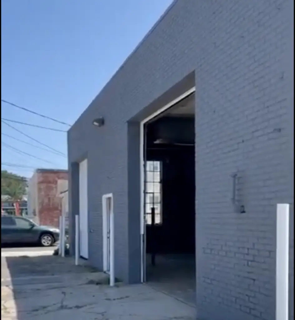
Neutral Palettes (White, Gray, Beige)
Neutrals are the gold standard for a reason. They offer a “timeless” look that appeals to the widest range of tenants and customers.
- Cool Grays: Highly popular for modern industrial parks and creative office spaces.
- Warm Beiges/Tan: Often required by local zoning or business park associations to ensure a cohesive look with surrounding properties.
- Crisp Whites: Provide a high-end, gallery-like feel but require more frequent cleaning.
Dark Accents for Modern Appeal
Many modern commercial designs utilize a “Charcoal” or “Iron Ore” accent. Using dark colors on window frames, entryways, or architectural trim creates a sophisticated, grounded look that masks minor imperfections and highlights the building’s structure.
Earth Tones for Durability and Low Maintenance
Earth tones like olive, slate, and muted terracotta are excellent for buildings in high-traffic areas. These colors harmonize well with natural landscaping and are superior at hiding the dust and road grime common in urban commercial corridors.
Colors That Hold Up Best Over Time
Maintenance is a top priority for any facility manager. Certain colors are more “forgiving” than others when it comes to the elements.
UV Resistance and Fading Considerations
In many parts of the U.S., intense UV exposure is the primary enemy of exterior paint.
- Organic Pigments (Bright Reds, Yellows, Purples): These tend to fade the fastest under direct sunlight, potentially requiring a repaint years sooner than planned.
- Inorganic Pigments (Earth tones, Grays, Beiges): These are naturally more stable and maintain their “true” color significantly longer.
Dirt and Stain Visibility
If your building is located near a highway or a construction zone, light colors like pure white or cream will show soot and dirt almost immediately. Mid-range grays and “greige” (a mix of gray and beige) are the most effective at maintaining a clean appearance between washings.
Matching Exterior Colors With Building Materials
Commercial buildings are rarely just one material. The paint must complement the existing “unpaintable” elements.
Brick and Masonry
If you have traditional red brick, choosing a cool-toned gray or a warm cream for the non-brick surfaces provides a classic contrast. If you are painting the brick itself (a growing trend), ensure you use breathable mineral paints to prevent moisture trapping.
Metal Panels and Siding
Metal buildings offer the opportunity for sleek, industrial finishes. High-gloss coatings in metallic silver or deep bronze can give an older metal building a complete “rebranding” without the cost of new siding.
Stucco and Concrete
Because these surfaces are textured, they create micro-shadows. Choosing a color with a slightly higher Light Reflectance Value (LRV) can help the building look brighter and more uniform across these rougher textures.
FAQs
What exterior colors attract customers?
Generally, colors that provide a sense of safety and cleanliness (like blues and whites) or energy and excitement (like orange or red accents) are most effective. The key is to match the color to the “energy” of your business type.
Are dark colors bad for commercial buildings?
Not necessarily, but they do absorb more heat. In warmer climates, a dark-colored building can increase cooling costs. However, dark colors are excellent for hiding architectural flaws and creating a premium “boutique” feel.
Should commercial buildings be repainted regularly?
Yes. Beyond aesthetics, regular painting prevents the degradation of the substrate. Most commercial properties should be professionally inspected every 5 years to ensure the coating system is still protecting the building envelope.
Elevate Your Business Image with Anderson’s Painting
The right color choice can transform your commercial property from “just another building” into a local landmark. At Anderson’s Painting, we don’t just apply paint; we provide color consultation services to ensure your investment pays off in both beauty and durability.
Is your building due for a color update?
Our team of professionals is ready to help you navigate the complexities of commercial color selection and application.
Contact Anderson’s Painting for a Professional Color Consultation and Quote.