The color of an office is far more than a decorative choice; it is a tool for performance. In the modern American workplace, facility managers and business owners are increasingly moving away from “stark white” walls in favor of palettes that influence behavior, mood, and productivity.
At Anderson’s Painting, we have seen firsthand how a strategic color shift can transform a stagnant office into a vibrant, high-energy environment. Here is a look at the colors that are currently defining the best-performing offices in the U.S.
How Paint Color Affects the Workplace
The science of color psychology suggests that our brains react to different wavelengths of light in predictable ways. In a commercial setting, this can be leveraged to achieve specific business goals.
Productivity and Focus
Certain colors can actually reduce eye strain and help employees stay “in the zone” for longer periods. For example, low-wavelength colors are known for their calming properties, preventing the mental fatigue that often sets in by mid-afternoon.
Mood and Employee Comfort
An office that feels too cold or clinical can increase stress levels, while an office that is too “busy” with bright colors can be overstimulating. The goal of a professional paint job is to create a “balanced” environment—one that feels welcoming to clients and comfortable for employees who spend eight hours a day within those walls.
Best Office Paint Colors by Space
A one-size-fits-all approach rarely works for a multi-functional office. Different zones require different psychological triggers.
Neutral Tones for General Work Areas
For large, open-concept spaces, greige (a mix of gray and beige), warm whites, and soft sands remain the gold standard.
- Why it works: These neutrals provide a clean, professional backdrop that doesn’t distract. They also maximize the reflection of natural light, making the space feel airy and modern.
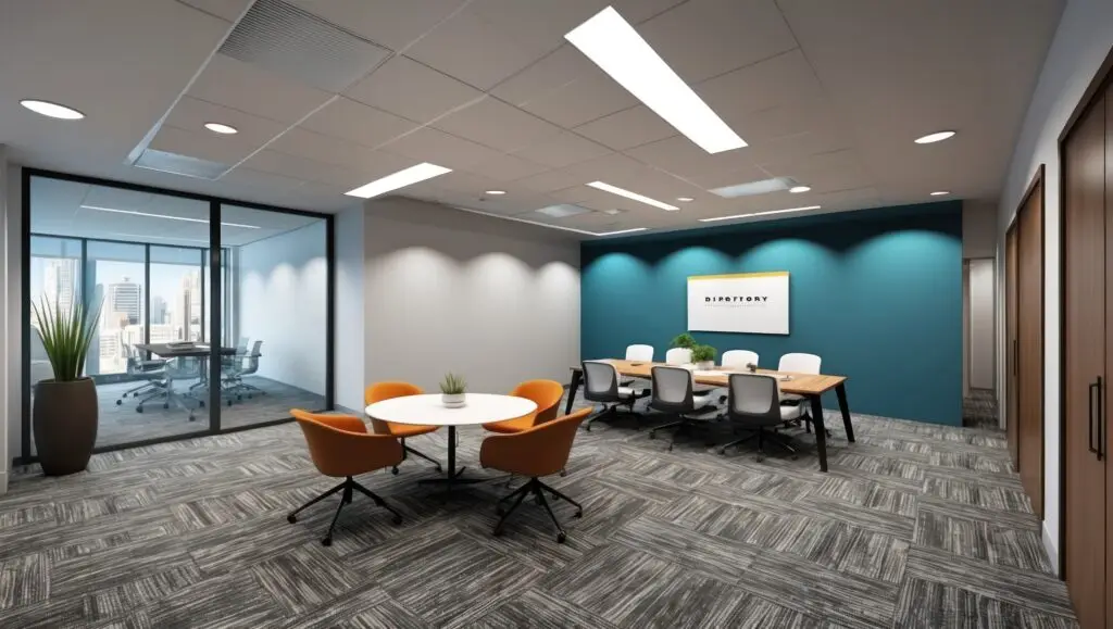
Blues and Greens for Focus
If your team handles high-stress tasks, data analysis, or deep creative work, consider shades of navy, sage, or teal.
- Blue: Often cited as the most productive color, it represents stability and logic.
- Green: Associated with nature and balance, it is the easiest color on the human eye and reduces fatigue.
Accent Colors for Meeting Rooms
Meeting rooms and “huddle spaces” are areas where you can afford to be more adventurous.
- Terracotta or Muted Orange: These tones encourage communication and social interaction, making them perfect for brainstorming hubs.
- Deep Charcoal: A dark accent wall behind a conference screen can provide high contrast, making digital presentations pop while adding a sense of sophisticated “authority” to the room.
Matching Colors With Brand Identity
Your office is a physical extension of your brand. However, there is a fine line between branding and overwhelming design.
Subtle Brand Color Integration
You don’t need to paint every wall your corporate “logo blue.” Instead, use your primary brand colors for:
- Entryway accent walls.
- Inner window frames or door trim.
- Built-in shelving or reception desks.
Avoiding Overly Bold Choices
While a bright “safety yellow” or “neon red” might be part of your brand, using them on large surface areas can lead to irritability and headaches. We recommend using “muted” versions of your brand colors for large walls—think a navy instead of a bright royal blue—to maintain professional composure.
Office Paint Finishes That Perform Best
In a commercial environment, the type of paint is just as important as the color.
Washable Finishes
For high-traffic corridors and breakrooms, we always recommend Scuff-X or similar high-performance scuff-resistant finishes in an eggshell or satin sheen. These finishes allow janitorial teams to wipe away marks without polishing the paint or leaving “ghost” streaks.
Low-VOC Options
Modern U.S. offices prioritize indoor air quality. We use Low-VOC (Volatile Organic Compounds) and zero-VOC paints to ensure that there are no “paint smells” or harmful off-gassing. This is especially critical if we are painting during business hours or in buildings with centralized HVAC systems.
FAQs
What colors make offices look bigger?
Cool-toned neutrals, such as light grays or “off-whites” with blue undertones, make walls appear to recede. Combined with a white ceiling, these colors can make a small, cramped office feel significantly more spacious.
Are dark office colors a bad idea?
Not at all. Dark colors like forest green or deep slate can create a sense of “cozy focus” in private offices or executive suites. The key is ensuring you have adequate lighting so the space doesn’t feel “cave-like.”
Should all offices use the same color scheme?
While a cohesive “flow” is important, varying the colors by room function (e.g., a calm blue for the quiet room and an energetic yellow for the breakroom) helps employees mentally transition between different types of work throughout the day.
Elevate Your Workspace with Anderson’s Painting
Choosing the right color is the first step toward a better workday. At Anderson’s Painting, we don’t just apply paint; we help you curate an environment that supports your business goals and reflects your professional excellence.
Ready to see how color can transform your office?
Contact Anderson’s Painting for a Professional Color Consultation and Estimate