When it comes to home improvement in the United States, few things offer a better return on investment than a fresh exterior paint job. While many homeowners stick to a single monochromatic shade, the trend toward “two-tone” exteriors is rapidly growing. By strategically using two primary colors, you can highlight architectural details, modernize an older home, and create a sense of depth that a single color simply cannot achieve.
Quick Answer: Two Colors Add Depth and Dimension
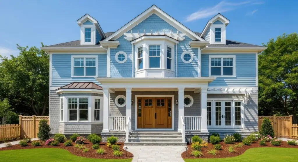
A two-tone paint scheme involves using one color for the “body” of the house (the siding or stucco) and a second, contrasting color for the “trim” or “accents” (shutters, doors, and gables). This approach creates visual boundaries that make the home’s architecture feel more deliberate and “custom-built.”
Why single-color exteriors look flat
Without contrast, the architectural nuances of a home—such as window casings, crown molding, and porch pillars—get lost. On a sunny day, a single-color house can look washed out, while on a cloudy day, it may appear heavy or dull. Introducing a second color creates “shadow and light” effects that define the home’s shape even in flat lighting.
Popular Two-Tone Exterior Color Combinations
Light body + dark trim
This is the quintessential “Modern Traditional” look. A light body (like cream, soft beige, or light gray) paired with dark trim (like navy, forest green, or espresso) provides a grounded, sophisticated feel. This combination is particularly effective on American Craftsman and Colonial-style homes, as it draws the eye to the sturdy lines of the window frames and rooflines.
Neutral siding + bold accents
If your home has a neutral base like “Greige” (a mix of gray and beige) or Taupe, you have the perfect opportunity to use a bold second color on specific features. A deep cranberry, mustard yellow, or sage green on shutters and the front door can make a neutral home stand out without feeling “loud” or overwhelming the neighborhood aesthetic.
White with black or charcoal details
The “Modern Farmhouse” trend has dominated the U.S. market for several years and shows no signs of slowing down. A crisp white exterior paired with stark black or charcoal trim creates a high-contrast, clean look that feels incredibly fresh. This palette works best when paired with natural elements like wooden porch columns or stone accents.
Where to Use the Second Color
To execute a two-tone look successfully, you must decide which elements receive the accent treatment.
Trim and shutters
The trim includes window casings, door frames, soffits, and fascia boards. Painting these a different color than the siding is the most common way to create a two-tone effect. Shutters are another excellent candidate for the accent color, as they provide vertical “pops” of color across the expanse of the siding.
Doors and architectural features
Don’t forget the gables (the triangular portion of the wall under a pitched roof) or the garage doors. In many modern American suburban designs, the garage door takes up a large portion of the front facade; painting it in the accent color can balance the weight of the house. The front door is often the “third” color in a scheme, but it can also be a more vibrant version of your secondary trim color.
Common Exterior Two-Tone Mistakes
Too much contrast
While contrast is the goal, there is such a thing as “visual vibration.” This happens when two colors are so different in intensity (like a bright white and a neon blue) that the edges where they meet seem to shimmer uncomfortably. Always look at large-scale swatches in natural sunlight before committing.
Ignoring roof and stone colors
Your roof is likely a significant “color” on your home’s exterior, usually in shades of gray, brown, or black. Your two-tone paint scheme must complement the roof color. Similarly, if your home has a stone or brick foundation, the undertones of those materials (warm or cool) should dictate your paint choices.
FAQs
Does two-tone exterior paint increase value?
Yes. Real estate experts often note that “curb appeal” is a primary driver for home valuation. A well-executed two-tone scheme makes a home look well-maintained and professionally designed, which can lead to higher offers and faster sales.
How many colors is too many?
The “Rule of Three” is standard in American exterior design: one main body color, one trim color, and one accent color (usually for the front door). Going beyond four colors can make a house look cluttered and disorganized.
Should exterior trim be lighter or darker?
There is no “wrong” answer, but they create different vibes. Darker trim (relative to the body) feels more modern and grounded. Lighter trim (white or cream on a darker body) feels more traditional and “pop-y,” emphasizing the windows and doors.
Protect and Beautify with Anderson’s Painting
Your home’s exterior is its first line of defense against the elements and its first impression on the world. At Anderson’s Painting, we specialize in high-quality exterior transformations that combine durability with high-end design. Our team can help you navigate the complexities of color selection to ensure your two-tone project highlights your home’s best features.
We use premium, weather-resistant paints designed to withstand the varying American climate, ensuring your two-tone investment stays vibrant for years to come.
Is it time to give your home the makeover it deserves? Contact Anderson’s Painting today for a professional exterior consultation and quote!