Warm house paint colors include tones such as soft beige, creamy white, warm gray, terracotta, and muted gold. These colors create a cozy and welcoming atmosphere while adding depth and character to interior spaces.
What Makes a Paint Color Warm?
The warmth of a color is determined by its undertones. Understanding the “temperature” of a paint is the first step toward achieving the right mood in your home.
Understanding warm undertones
Warm colors are formulated with hints of yellow, red, or orange. Even a color that looks “neutral” at first glance can have a warm undertone that makes the room feel sunnier and more inviting compared to a “cool” neutral with blue or green bases.
Warm vs cool paint colors
While cool colors (blues, greens, purples) tend to recede and create a sense of calm and airiness, warm colors advance, making a space feel more intimate and grounded. Warm tones are often associated with energy, comfort, and social interaction.
How lighting affects warm colors
Warm colors are highly reactive to light. In a room with plenty of sunlight, warm tones will glow and feel vibrant. In a room with north-facing light (which is naturally cooler), warm paint helps counteract the “gray” cast, making the space feel less chilly.
Most Popular Warm House Paint Colors
If you are looking for a timeless look that feels modern yet classic, these are the top contenders:
- Warm beige: Often called “greige” or “oatmeal,” these are the ultimate versatile neutrals.
- Creamy white: Unlike stark, clinical whites, creamy whites (like Benjamin Moore’s Simply White) have a soft yellow base that feels like silk.
- Warm gray: Also known as “stony” grays, these provide the modern look of gray without the cold, industrial feel.
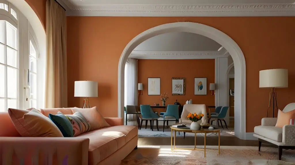
- Terracotta tones: These earthy reds and oranges add a rustic, Mediterranean vibe that is currently trending in US interior design.
- Soft gold and honey tones: These bring a permanent sense of sunshine into a room, working beautifully in kitchens and dining areas.
Warm vs Cool Colors in Interior Design
Benefits of warm color palettes
Warm palettes are scientifically proven to make people feel more relaxed and stimulated. They are ideal for “social” rooms where you want guests to feel welcome and for bedrooms where you want to retreat into a cozy “cocoon.”
When cool colors may work better
Cool colors are often preferred in small, cramped spaces where you want the walls to “disappear,” or in home offices where a sense of focus and calm is more important than coziness.
Best Warm Paint Colors by Room
Living rooms and open spaces
For the main hub of the home, a soft warm beige or light greige is perfect. It provides a neutral backdrop that works with almost any furniture style while keeping the space feeling unified and bright.
Bedrooms and hallways
In bedrooms, terracotta or muted gold can create a luxurious, high-end feel. For hallways, which often lack natural light, a creamy white helps the space feel less like a tunnel and more like an inviting transition.
Kitchens and dining rooms
Kitchens look stunning with warm gray cabinets or honey-toned walls. These colors complement natural wood flooring and stone countertops, creating a heart-of-the-home atmosphere that encourages family gatherings.
Warm Color Combinations That Work Well
Beige and white combinations
Pairing a warm beige wall with a crisp, creamy white trim creates a sophisticated, high-contrast look that is timeless and clean.
Terracotta with natural wood
The orange and red notes in terracotta harmonize perfectly with oak, walnut, or pine furniture, emphasizing the natural beauty of the wood grain.
Warm gray with cream accents
Using a mid-tone warm gray on the walls with cream-colored textiles and rugs creates a balanced, modern aesthetic that feels both sleek and comfortable.
How to Avoid Yellow or Orange Overtones
Choosing balanced undertones
The biggest fear with warm colors is that the wall will look “too yellow” or “neon orange.” To avoid this, look for colors that are “muted” with a bit of gray or brown. These “dirty” versions of warm colors look much more sophisticated on a large wall.
Testing paint samples first
Never choose a warm color from a tiny swatch. Paint a large sample (at least 2×2 feet) on different walls of the room. Observe it in the morning, afternoon, and under your lightbulbs at night to ensure the undertone remains pleasing.
How Lighting Affects Warm Paint Colors
Natural daylight
South-facing rooms receive warm, golden light throughout the day. This will intensify the warmth of your paint. North-facing rooms receive blue-toned light, which can make warm colors look more neutral and “safe.”
Warm artificial lighting
Standard incandescent or “warm white” LED bulbs will enhance the red and yellow tones in your paint. If your room starts looking too orange at night, try switching to “cool white” or “daylight” bulbs to balance the color.
Room orientation
Before painting, identify which way your windows face. This is the secret trick professional painters at Anderson’s Painting use to help clients pick the perfect shade for their specific environment.
Tips for Choosing Warm House Colors
Consider existing furniture
Warm colors look best with “warm” materials. If you have a brown leather sofa or mahogany tables, warm wall colors will complement them. If your furniture is ultra-modern with chrome and glass, you may want to lean toward a “warm gray” to bridge the gap.
Coordinate with flooring
Flooring is your “fifth wall.” Warm tones look incredible with hardwood, tan carpeting, or travertine tile. If you have gray LVP (Luxury Vinyl Plank) flooring, choose a warm gray to ensure the tones don’t clash.
Use accent colors carefully
You don’t have to paint the whole room terracotta. Using a bold warm color on a single accent wall while keeping the rest of the room in a creamy white is a great way to add “pop” without overwhelming the space.
FAQ: Warm House Paint Colors
What colors are considered warm paint colors?
Any color with a base of yellow, orange, or red. This includes shades like cream, tan, beige, gold, peach, and terracotta.
Are warm colors good for living rooms?
Yes! They are the best choice for creating a space that feels welcoming and comfortable for both family and guests.
What warm color makes a room feel bigger?
Creamy white is the best warm option for small rooms. It reflects light like a cool white but maintains a soft, inviting glow that prevents the room from feeling “boxy.”
What are the most popular warm house colors?
Currently, Sherwin-Williams Alabaster (creamy white), Benjamin Moore Revere Pewter (warm greige), and various shades of terracotta are leading the trends.
Do warm colors make a home feel cozy?
Absolutely. Warm colors physically change the “feel” of a room, making it feel more protected, intimate, and physically warmer to the eye.
We understand that choosing the perfect warm neutral can be a challenge. If you’ve recently used one of our recommended warm paint color strategies—like a successful greige over cool gray floors, or a beautiful creamy white in a north-facing room—we’d love to hear about it!