In the world of interior design and painting, “neutral colors” are the unsung heroes. They form the backbone of countless stylish and timeless interiors, offering a versatile canvas upon which other design elements can shine. For homeowners in the U.S. seeking a sophisticated, adaptable, and calming aesthetic, understanding neutral colors, what they are, their types, and how to use them – is key to a successful home refresh.
What makes a color neutral?
At its core, a neutral color is one that appears to lack strong color, providing a versatile backdrop that harmonizes with a wide range of other hues. While often perceived as “boring” or “lackluster,” true neutrals are anything but.
- Absence of Strong Hue: Neutrals typically don’t appear on the traditional color wheel as primary, secondary, or tertiary colors.
- Foundation: They act as a foundational element in design, allowing other colors, textures, and patterns to take center stage without competing for attention.
- Common Examples: The classic neutrals include:
- White: Crisp, bright, and clean.
- Beige/Cream: Warm, inviting, and earthy.
- Gray: Sophisticated, modern, and versatile.
- Taupe: A blend of gray and brown, offering warmth and depth.
- Greige: A popular blend of gray and beige, balancing warm and cool undertones.
- Beyond the Basics: While the above are the most common, some designers also consider very muted versions of colors like soft olives, dusty blues, or subtle charcoals as “near neutrals” due to their versatility and ability to recede into the background.
Warm vs. Cool neutrals: Difference & selection
Even within the seemingly simple category of neutrals, there’s a crucial distinction that impacts a room’s feel: undertones.
- Warm Neutrals: These neutrals have yellow, red, orange, or brown undertones.
- Examples: Cream, beige, taupe with a strong brown/red undertone, warm grays (with yellow/brown undertones like “greige”).
- Effect: They create a cozy, inviting, comforting, and sometimes earthy atmosphere. They work well in north-facing rooms that tend to be cooler, or to complement warm wood tones and traditional decor.
- Cool Neutrals: These neutrals have blue, green, or purple undertones.
- Examples: Cool grays (with blue/green undertones), crisp whites, cool taupes.
- Effect: They create a serene, fresh, sophisticated, and often modern feel. They are excellent for bright, south-facing rooms that receive abundant warm light, helping to balance the brightness. They pair well with blues, greens, and contemporary furnishings.
Selection Tip: Hold paint swatches against existing elements in your room (flooring, upholstery, fixed cabinetry). Observe them in different lighting conditions to identify their true undertones.
Undertones and light reflective value (LRV)
Understanding these two concepts will elevate your neutral color choices.
- Undertones: These are the subtle hints of color that reveal themselves in different lighting or when placed next to other colors. A “gray” might lean green, blue, or even purple depending on its undertone.
- How to Spot: Place a pure white piece of paper next to the paint swatch. The true undertone will often become more apparent. Compare multiple similar shades to see their differences.
- Light Reflective Value (LRV): This is a measurement (on a scale of 0 to 100) of how much visible and usable light a color reflects.
- High LRV (closer to 100): Lighter colors that reflect more light, making a room feel brighter and more spacious. Ideal for small rooms or those with limited natural light. (e.g., pure white has a very high LRV).
- Low LRV (closer to 0): Darker colors that absorb more light, making a room feel cozier, more intimate, and sometimes smaller. (e.g., deep charcoal has a low LRV).
- Design Tip: Use LRV to predict how bright or dark a room will feel, especially when selecting neutrals. A neutral with a high LRV can still feel warm if it has warm undertones.
Where to use neutrals by room type
Neutrals are incredibly versatile and can be used effectively in almost any room:
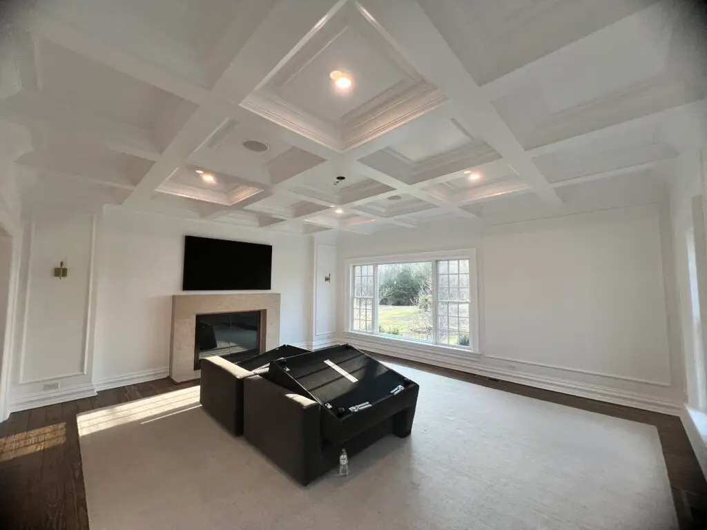
- Living Rooms: Excellent for walls, creating a calm and inviting backdrop for colorful furniture, artwork, and textiles. Greiges, warm grays, and soft creams are popular.
- Bedrooms: Soothing light grays, warm whites, and soft taupes promote relaxation and create a serene escape.
- Kitchens: White or light gray cabinets are classic. Walls can be painted in warm neutrals or cool grays, providing a clean canvas for backsplashes and countertops. Check it out the most common kitchen paint colors.
- Bathrooms: Crisp whites, light blues, or serene grays create a clean, spa-like feel, making the most of often-small spaces.
- Hallways & Entryways: Neutrals are perfect for these transitional spaces, ensuring a smooth flow between rooms and preventing visual clutter.
See more: Kitchen paint ideas: Color trends & tips for every style
Pairing neutrals with accent hues & textures
The magic of neutrals truly shines when they are layered with other elements.
- Accent Hues: Neutrals allow accent colors to pop. For example:
- Warm neutrals (beige, cream) pair beautifully with earthy tones like terracotta, olive green, or rich browns.
- Cool neutrals (gray, crisp white) complement blues, greens, jewel tones (emerald, sapphire), and even vibrant yellows.
- Black or deep charcoal accents (frames, hardware, furniture) provide striking contrast and sophistication against any neutral.
- Textures: To keep a neutral room from feeling bland, introduce a variety of textures.
- Soft Textures: Plush rugs, chunky knit throws, linen curtains, velvet pillows.
- Hard Textures: Wood (light or dark), metal (brass, chrome, iron), stone (marble, granite), wicker, rattan.
- Visual Interest: Mix matte finishes with glossy surfaces, smooth fabrics with rough weaves.
Sampling & choosing neutrals confidently
The final step is to test your chosen neutrals thoroughly.
- Get Samples: Purchase sample pots of your top 2-3 neutral choices. Don’t rely solely on tiny paint chips.
- Paint Large Swatches: Apply large swatches (at least 2’x2′) on multiple walls in the room you’re painting. Paint two coats to see the true color.
- Observe in All Lights: Crucially, observe these swatches throughout the day – morning, afternoon, evening, and under artificial light. How do they look with the sun streaming in? How do they look with your lamps on at night?
- Compare to Fixed Elements: See how the neutrals interact with your flooring, cabinetry, furniture, and other permanent fixtures. Do their undertones clash or harmonize?
- Consider Your Mood: Ultimately, how does the color make you feel? Does it create the desired ambiance for the room’s function?
By understanding and strategically using neutral colors, U.S. homeowners can create timeless, elegant, and effortlessly beautiful spaces that feel both refined and deeply personal.
Ready to explore the power of neutrals for your home’s interior? Anderson’s Painting offers expert color consultation and professional painting services that bring your design vision to life. Contact us today for a refreshed and inspired home!